Poster Presentation Guidelines
Poster Session Policies
FYI
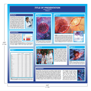
- The poster dimensions are 3’9″ high and 3’9″ wide
- All accepted abstracts, including those selected for a Major Symposium or Podium Presentation, are required to be presented as a poster.
- Your assigned presentation date/s cannot be changed.
- If you decline this invitation, your abstract will be withdrawn.
- No scientific sessions are scheduled during the Poster Session times.
- Posters are viewable for one day only.
- Posters are to be placed between 7:00 AM – 9:00 AM CT on the assigned day, on the assigned board and removed between 4:30 PM – 5:00 PM CT daily. Posters not removed by this time daily will be taken down and discarded.
- Any authors failing to display their poster throughout their assigned day, and/or be present during their assigned poster session will forfeit publication of their abstract in the on-line supplement to The Journal of Immunology.
- Corresponding AAI travel awardees will, additionally, forfeit their award.
- Photographs will be taken of poster boards missing a poster.
- To uphold the integrity of the meeting and be respectful of authors and speakers, recording by any means, including but not limited to: photographing, audio or video recording of any presentations or sessions during the meeting is strictly prohibited.
All first authors must be present at their poster using the following guidelines:
For crowd control reasons, we have designed a new poster presentation schedule.
If you are scheduled to present your poster on either Saturday, May 4 or Sunday, May 5, you are required to be at your poster to discuss your work using the following parameters:
- Odd numbered poster boards (i.e. B101, B103, B105, B237, B389, etc.)
Between the hours of 11:30 AM – 12:45 PM CT on the assigned day. - Even number poster boards (i.e. B100, B102, B104, B238, B390, etc.)
Between the hours of 3:15 PM – 4:30 PM CT.
If you are scheduled to present your poster on Monday, May 6, you are required to be at your poster to discuss your work using the following parameters:
- Odd numbered poster boards (i.e. B101, B103, B105, B237, B389, etc.)
Between the hours of 11:30 AM -12:45 PM CT on their assigned day. - Even number poster boards (i.e. B100, B102, B104, B238, B390, etc.)
Between the hours of 2:15 PM – 3:30 PM CT.
Poster Dimensions and Style Guidelines

- The poster dimensions are 3’9″ high and 3’9″ wide. Be sure to note these dimensions as you will not be permitted to extend into another presenter’s space.
- Prepare a 6″ high headline strip that runs the full width of the poster. Include the title, authors, and affiliations on the strip in letters not less than 1″ high.
- Post a large-typed copy of your abstract in the upper left-hand corner.
- Posters should be legible at five feet.
- The poster’s message should be clear and comprehensible without verbal explanation.
The following information has been suggested to help improve the effectiveness of your poster communication.
Initial Sketch: Plan your poster early. Focus your attention on a few key points. Try various styles of data presentation to achieve clarity and simplicity. Does the use of color help? What needs to be expressed in words? Suggest headlines and text topics.
Rough Layout: Enlarge your best initial sketch, keeping the dimensions in proportion to the final poster (see diagram). Ideally, the rough layout should be full size. A blackboard is a convenient place to work. Print the title and headlines. Indicate text by horizontal lines. Draw rough graphs and tables. This will give you a good idea of proportions and balance. Ask associates for comments. This is still an experimental stage.
Text Layout: Avoid abbreviations, acronyms, and jargon. Use a consistent font throughout. It is recommended that authors use a 20-pt. font size; this makes the text legible from five feet away.
Final Layout: The artwork is complete, and the text and tables are typed, but not necessarily enlarged to full size. Now ask, is the message clear? Do the important points stand out? Is there a balance between words and illustrations? Is there spatial balance? Is the pathway through the poster clear?
Balance: Figures and tables should cover slightly more than 50% of the poster area. If you have only a few illustrations, enlarge them. Do not omit text, but keep it brief. The poster should be comprehensible without verbal explanation.
Eye Movement: The movement (pathway) of the eye over the poster should be natural, down the columns or along the rows. Size attracts attention. Arrows, pointing hands, numbers, and letters can help clarify the sequence.
Simplicity – Resist the temptation to overload the poster. More material may mean less communication.
